34

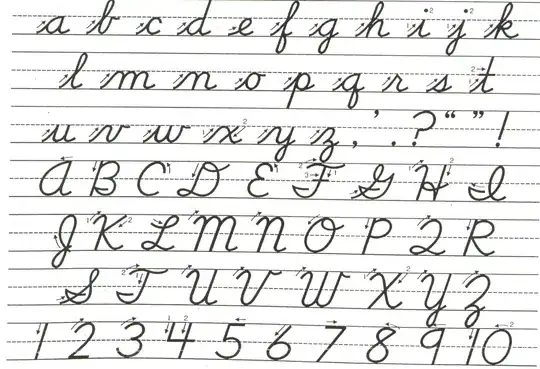
I have a formula in a paper that I want to write out by hand, and it contains two "D"s, a normal D, $D$ in latex, and a 'mathcal', caligraphic D, $\mathcal{D}$ in latex.

What are some common/standard/convenient ways to write out a mathcal D by hand, so that it is obviously different from a 'normal' D?

Hugh Perkins
  • 687
  • 1
  • 7
  • 14
  • 3
    I would write $D$ in the same way which you use in handwriting when text consists only of capital letters, such as here. And for $\mathcal D$ I would use the usual way for handwritten capital $D$, such as here. – Martin Sleziak Nov 13 '12 at 09:22
  • @martin, your second link http://4.bp.blogspot.com/_kmwlCU4Gz0A/TJtqjxkrGTI/AAAAAAAAAAc/IlM-TV22iR0/s1600/cursive2-774480.gif is very useful. If you put that as an answer, I will mark that as accepted (well, unless anyone comes up with anything even better of course!) – Hugh Perkins Nov 13 '12 at 09:37
  • 2
    If you really want a step-by-step guide, see this page. – user642796 Nov 13 '12 at 09:53
  • 8
    While not strictly on-topic here, this is an interesting math-related question and there are no other SE sites to which this could be migrated. – robjohn Nov 13 '12 at 10:01
  • 1
    @robjohn: Perhaps it would belong on the Mathematics Educators site. See http://matheducators.stackexchange.com/questions/4427/distinguishing-script-letters-from-regular-letters-in-handwritten-mathematics and http://matheducators.stackexchange.com/questions/41/what-is-a-good-handwriting-font-for-mathematics. – J W Sep 19 '14 at 17:52
  • 1
    @JW see this answer. Perhaps we can migrate when the site graduates. – robjohn Sep 19 '14 at 18:08
  • @robjohn: Just a remark after nearly two years - Mathematics Educators has not graduated yet and would presumably need a significant boost in questions and active users in order to do so. That said, it does remain active and arguably has stabilized. Perhaps long-running beta sites should be reconsidered for migration paths. – J W Aug 22 '16 at 08:16
  • 1
    Looks like there is https://tex.stackexchange.com now? – Hugh Perkins Aug 20 '17 at 11:42

7 Answers7

28

You can try to imitate my calligraphy, follow the one in the other answers or develop your own. enter image description here

http://www.myscriptfont.com/

http://www.fontlab.com/font-editor/fontographer/

enter image description here enter image description here enter image description here

15

To give a slightly flippant answer: put an extra loop somewhere. It doesn't really matter where you put the loop, a loop is necessary and sufficient for your audience to think it's calligraphic.

Noah Snyder
  • 10,005
13

Per OP's request I'm posting my comment as an answer.

I would write $D$ in the same way which you use in handwriting when text consists only of capital letters (resembling $\mathrm{D}$), such as in the following picture, which I downloaded from here enter image description here

And for $\mathcal D$ I would use the usual way for handwritten capital $D$, such as in the following picture, which I found here. enter image description here

5

How curious; when I was younger lots of people were struggling to find a way to get the things they knew how to write on paper or on the blackboard into print in a recognisable way, now it is the other way around. Anyway, in writing there is no absolute uniformity and different people write the same thing in many different ways (when I started teaching in France, I had to get used to the fact that students here write $z$ in a way that to me looks perfectly like a $y$, but they write $y$ just a tad differently). Just make sure you write your $\mathcal D$ in a way that looks "handwritten" and somewhat resembles a "D", but sufficiently different from how you write $D$ (and much depends on what that is). Personally I tend to make a little loop at the bottom left of $\mathcal D$ to suggest it is written in one continued stroke (which is indeed they way I write it), while $D$ has two separate strokes.

5

I got this from my Topology professor:

For letters with a leading vertical line, make a mathcal with a prominent down-stroke. Start at the top of the line, go down in an arc, then come up to the left, so the vertical line of the D is kind of an elongated oval instead of a line. Then complete the D normally. Add some flourishes strategically to make it clear what letter it is, that part will vary with your individual handwriting; just practice a bit until it looks right.

This works for D, P, R, K, B, M, and N really well. It also kind of works for E, F, and T.

3

$\mathcal{D}$ is calligraphic, not gothic. $\mathfrak{D}$ is gothic. I learned to write calligraphic letters when I was 6 or 7 years old, but it is very common to switch to "normal" upper-case letters when growing up. I suggest you should look for your old exercise book :-)

Siminore
  • 35,136
0

Although you say two dees, you actually specify three: roman, italic, and calligraphic. I write roman letters (in mathematics) in a boxy upright angular style, with serifs where possible; italic letters are written in my natural style; and script or calligraphic letters are decorated with twirly or looped ends.

John Bentin
  • 18,454