In "Power-law Distributions in Empirical Data", the authors give several examples of alleged power-laws. For instance, they plot node degree distribution of the Internet like this (p. 24):
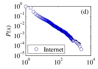
where $P(x)$ is the cumulative distribution function and the black dashed line is the power-law fit, starting from some $x_{\text{min}}$.
As far as I understand, $P(x)$ is calculated as
$$ P(x) = \frac{|\{v : v \in V \wedge \text{degree}(v) > x\}|}{|V|} $$
i.e. the fraction of nodes that have degree higher than $x$.
According to Wikipedia, plotting the cumulative distribution is common when plotting power laws. However, if I want to plot my power-law fit as well in the same chart, what do I plot? I do have an exponent $k$ that I understand to mean that the frequencies of degrees follow a power law $y \propto x^{-k}$. How do I derive a function from this that can be displayed in the cumulative distribution plot like the dashed power-law fit in the example plot above?