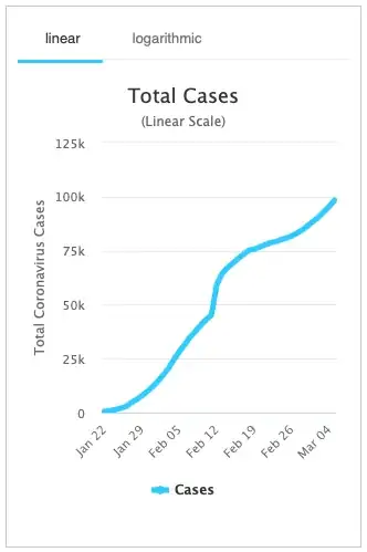
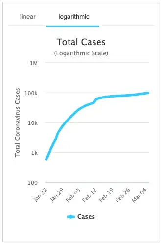
...essentially, why would someone want to look at a logarithmic scale graph? What can be derived from a logarithmic scale graph that makes it worthy of presentation in addition to a linear scale version?
At worldometer on Coronavirus there is a graph in "linear scale" (the default) and a tab with a "logarithmic" scale version.
Here they are:

