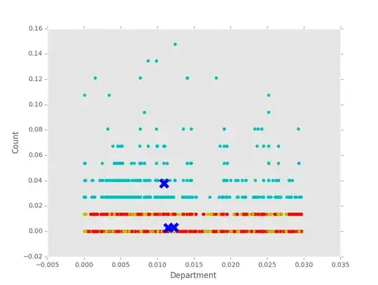
I started tinkering with sklearn kmeans last night out of curiosity with the goal of clustering users into groups to see what kind of user groups I can derive. I am lost when it comes to plotting the results as most examples have nice (x,y) coordinates. For example, the iris data set has pedal width and pedal length. From my experimentation, I don't seem to have anything that displays very nice. Is this assumption correct / does anyone have tips, pointers, learning resources that they could offer?
import pandas as pd
import pprint
import numpy as np
from sklearn.preprocessing import normalize
from sklearn.preprocessing import LabelEncoder
from sklearn.cluster import KMeans
from collections import defaultdict
import matplotlib.pyplot as plt
from matplotlib import style
style.use('ggplot')
I normalized the data as it had a wide variance...again, not sure if this is a correct assumption to make
X = np.array(normalize(data, axis=0, copy=False))

kmeans = KMeans(n_clusters=3)
pred = kmeans.fit_predict(X)
labels = kmeans.labels_
cent = kmeans.cluster_centers_

plt.scatter(X[:, [4]], X[:, [6]])
plt.scatter(cent[:, [4]], cent[:, [6]], marker="x", s=150, linewidths=5, zorder=10)
plt.ylabel('Count')
plt.xlabel('Department')
plt.show()
Any pointers are appreciated, I will include sample data below. Thanks!
Sample Data:
emp_type,title,work_country,director_userid,dept_name,business_unit_name,UserCNT
0,9,7,29,20,2,2
0,13,7,8,14,6,5
0,4,3,56,29,8,3
0,15,3,36,32,2,3
0,4,3,32,16,2,0
0,4,1,40,13,6,0
0,4,3,62,12,4,1
0,13,7,61,5,13,4
2,1,3,70,35,15,2
0,4,3,64,4,13,0
2,1,3,43,43,2,0
0,13,7,50,17,16,0
2,1,3,31,26,2,1
2,1,3,65,58,17,0
0,4,3,57,63,12,0
2,1,6,7,45,18,2
2,1,3,43,42,2,0
1,1,7,65,58,17,0
2,1,3,32,16,2,0
2,1,3,29,20,2,0
0,4,0,50,17,16,2
0,5,3,20,23,9,0
0,9,3,32,16,2,2
0,4,3,5,51,12,0
2,1,7,51,53,7,0
0,13,7,37,55,12,0
2,1,4,19,62,13,0
Example clustering using entire data set:

I added a chart for what my "Clusters" currently look like
– anshanno Oct 04 '16 at 18:05