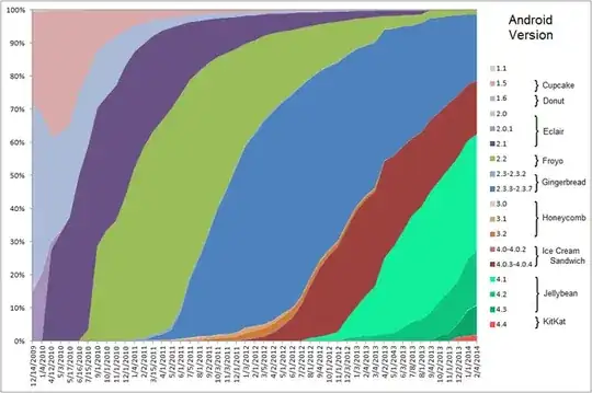
Google of course provides their snapshot of the current API situation. I'm curious to know if there is somewhere published a line graph showing the distributions and their change over time.
Asked
Active
Viewed 1,596 times
4
-
hm there is a better graph in the Google I/O android videos, I would like to find it. It shows the snapshots pies as larger and larger pies over time as the # of android devices increased. – CQM Jan 13 '14 at 21:26
2 Answers
4
Here is a site that automatically updates to the latest data from the android.com Dashboard, and which has three graphs showing different aspects of it.
Maxime
- 934
- 4
- 17
- 28
Hendrik Boshoff
- 56
- 1
3
Compro01
- 4,556
- 1
- 26
- 34
-
1This graph, while being nice, is much less up to date than the one found using @Hendrik's answer. – Benoit Duffez Jan 12 '16 at 08:48
-
@BenoitDuffez - It was up to date at the time I made this answer (and for almost another year past then), thought it seems that the creator of this graph is no longer maintaining it. – Compro01 Jan 12 '16 at 23:07
-
